Climate Change Infographics
It’s NOW or NEVER
This page gives you an overview of graphs used by leading journals to explain the effects of climate change. The situation is more urgent than you might have thought. So, please take the time to inform yourself!Countries suffering the most
Among the ten countries that suffered most in total between 1992 and 2011, there’s not a single industrialized nation. On the contrary, it’s poor countries like Honduras, Myanmar, Nicaragua and Bangladesh that have been at the eye of the climate storm.

Fig 1: Countries affected by climate change
Greenhouse gas emissions in Kyoto Protocol countries and their targets
With an estimated average emission reduction of 20.5% over 2008-2012 period, excluding United States and Canada, industrialized nations are certain to achieve their targets quite comfortably.
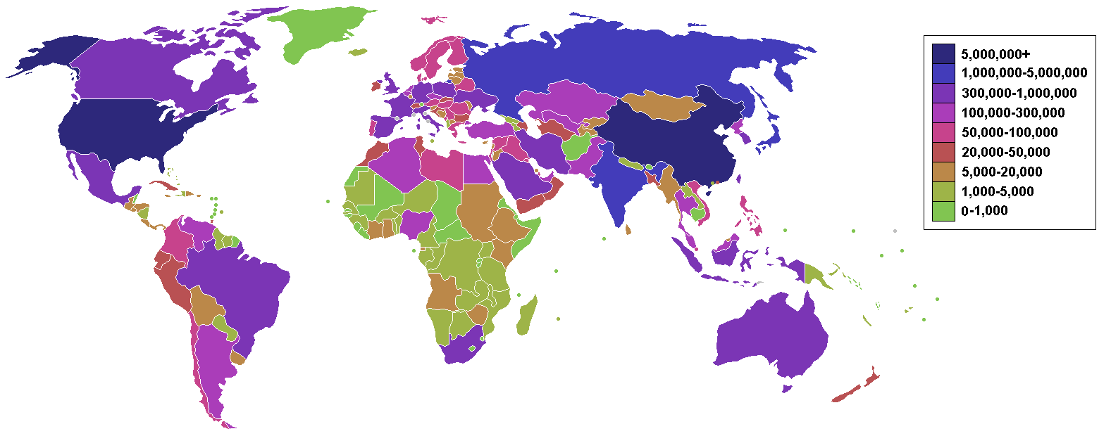
Fig. 2: List of countries by carbon dioxide emissions
For global CO2 emissions, 2012 was a remarkable year in which emissions increased by only 1.1%, which is less than half of the average annual increase of 2.9% seen over the last decade, reaching a new record of 34.5 billions tonnes.
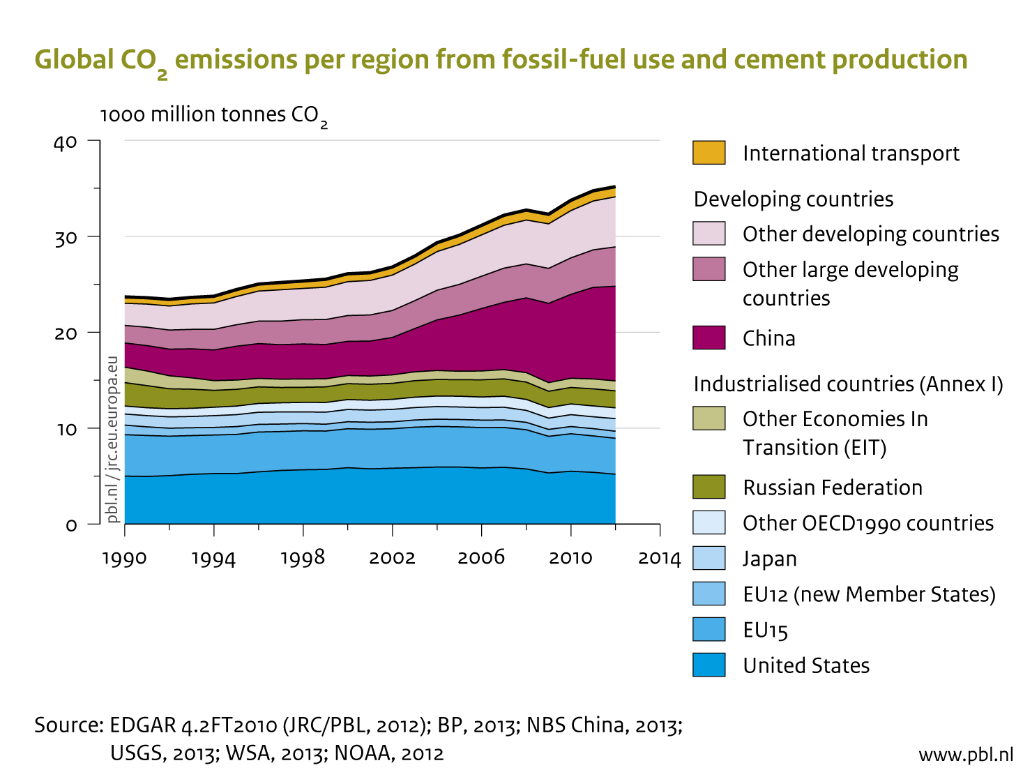
Fig. 3: Global CO2 emissions per region
In India, South Africa, Australia, Indonesia and China where power generation is heavily coal based, electric car emissions can actually end up being similar to traditional petrol and diesel vehicles. In fact, an electric car in India generates as much carbon as a 20 miles per gallon petrol vehicle in the United States.
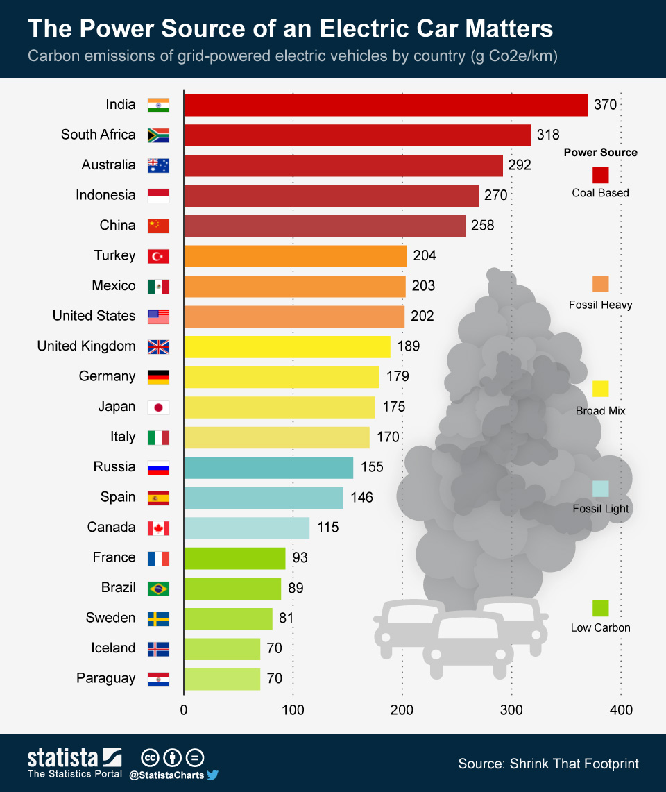
- Fig. 5: Carbon Emission of grid-powered Electric Vehicles by Country (g CO2e/Km)
Agricultural loss due to climate change
Below, you find a map of overall vulnerability of nations to agricultural productivity loss, indicating that key focal areas are located in Africa and South Asia.
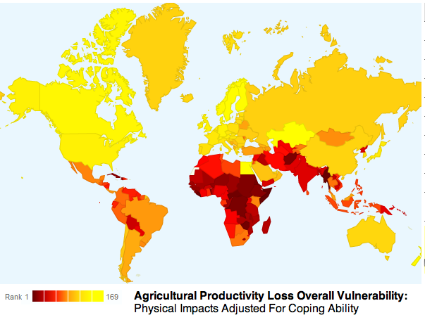
Fig 4.: Agricultural productivity loss overall vulnerability
Deforestation Index
Surprisingly, China and the U.S.—the world’s first and second largest producers of carbon emissions, respectively—ranked in the bottom five (low risk) on the Deforestation Index. In both countries, heavy investments in reforestation projects have aided the return of forest cover since the 1990s.
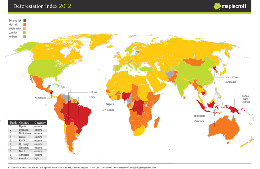
Deforestation Index 2012
Animal extinction
The graph below shows the numbers of threatened and endangered animal species in Africa. The group of bars on the far left shows totals for all of Africa’s different categories of animals (mammals, birds, reptiles, etc.), and the other four sets of bars are broken down by region within Africa.
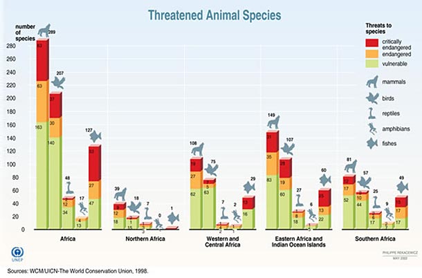
Threatened and endangered animal species in Africa
[meteor_slideshow slideshow=”explaining-climate-change”]